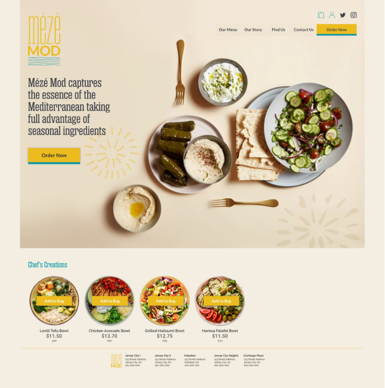
Design the brand identity and website for Mézé Mod, a local restaurant, ensuring clear, intuitive navigation and a streamlined food ordering process.
Many local restaurant websites suffer from cluttered designs and inefficient systems for browsing and customizing orders for delivery or pickup. Our goal is to simplify the process, making it effortless for customers to order healthy, local, and organic food from this sustainable restaurant. The website should reflect Mézé Mod’s commitment to quality and sustainability, with a clean, modern design that makes healthy, local, and organic food accessible to all.
My Role
UX designer leading the Mézé Mod website design.
Conducting interviews, paper and digital wireframing, low and high-fidelity prototyping, conducting usability studies, accounting for accessibility, iterating on designs, determining information architecture, and responsive design.
UX designer leading the Mézé Mod website design.
Conducting interviews, paper and digital wireframing, low and high-fidelity prototyping, conducting usability studies, accounting for accessibility, iterating on designs, determining information architecture, and responsive design.
Brand Identity | UX Design | Responsive Web Design
Project for Google UX Design Professional Certificate
The Design | Brand Identity
Empathize & Define | The User
Conducted interviews and created empathy maps to understand the users I’m designing for and their needs. A primary user group identified through research was your busy working adults who is looking for healthy & freshly made meals. They are adventurous foody. However, many local restaurant websites are overwhelming and confusing to navigate, which frustrated many target users.
Pain Points
Time
Busy young adults don’t have time to cook healthy meals everyday and would like to have option to order food couple of times a week.
Time
Busy young adults don’t have time to cook healthy meals everyday and would like to have option to order food couple of times a week.
Navigation
Local food restaurant website designs are often too cluttered, which results in confusing navigation.
Local food restaurant website designs are often too cluttered, which results in confusing navigation.
Sustainability
Online food delivery restaurants don’t have locally grown and sustainable food system.
Online food delivery restaurants don’t have locally grown and sustainable food system.
User Personas
User Journey Map
Persona
Kevin
Kevin
Goal
Place and order for large group from local Mediterranean restaurant for delivery.
Place and order for large group from local Mediterranean restaurant for delivery.
Problem Statement
Kevin is a financial analyst, who needs local restaurant which delivers freshly made food for group of his friends.
Kevin is a financial analyst, who needs local restaurant which delivers freshly made food for group of his friends.
Ideation & Prototype | The Design
The Sitemap
Hard to find local restaurant with easy online ordering systems was a primary pain point for users, so I used that knowledge to create a sitemap. My goal here was to simplify navigation and improve customization in ordering process. The structure I chose was designed to make things simple and easy to follow.
Hard to find local restaurant with easy online ordering systems was a primary pain point for users, so I used that knowledge to create a sitemap. My goal here was to simplify navigation and improve customization in ordering process. The structure I chose was designed to make things simple and easy to follow.
Paper & Digital Wireframes
Next, I sketched out paper wireframes for each screen in my app, keeping the user pain points about navigation, browsing, and checkout flow in mind. The home screen paper wireframe variations to the right focus on optimizing the browsing experience for users.
Next, I sketched out paper wireframes for each screen in my app, keeping the user pain points about navigation, browsing, and checkout flow in mind. The home screen paper wireframe variations to the right focus on optimizing the browsing experience for users.
Moving from paper to digital wireframes made it easy to understand how the redesign could help address user pain points and improve the user experience. Prioritizing online order button locations and visual element placement on the home page was a key part of my strategy.
Low-Fidelity Prototype
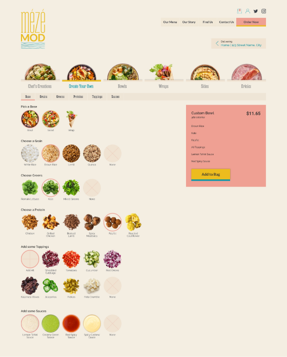
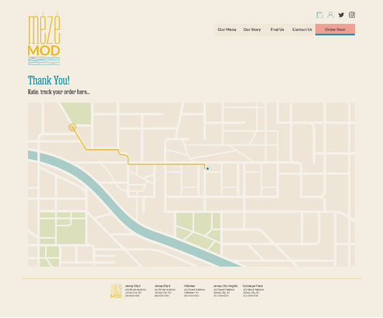
To create a low-fidelity prototype, I connected all of the screens involved in the primary user flow of creating custom dish from menu and complete the order process.
To create a low-fidelity prototype, I connected all of the screens involved in the primary user flow of creating custom dish from menu and complete the order process.
Test | Refined Mockups
